
Visualizing construction data is a constantly evolving practice, one that probably began with physical pins on a site map and has grown into the use of configurable, digital maps with real-time updates from the job site. The technological improvements to the visualization of construction data make sense, not just in the natural course of innovation, but in adapting the tools we use to how we naturally operate as humans. Time and time again, studies prove that the vast majority of humans are visual learners and need to see information in order to better retain it. We’ll dive into the various specific benefits of visualizing construction data in this article, but first and foremost is the simple fact that it provides a more effective way of communicating project information. If your project manager only needs to see data on map once versus multiple reviews of field notes, the impact of efficiency is straightforward. But there are many other benefits to visualizing construction data, including collaboration, transparency, responsiveness, and a deeper level of insight.
Improving collaboration for teams and across departments
Construction data visualization can help collaboration between team members, but also across departments. There’s sometimes an invisible line that divides design, construction, operations/maintenance, and GIS teams with little to no collaboration and communication between them. If each team is feeding their respective data into a shared construction data dashboard, it provides a natural nexus for cross-departmental collaboration. Design can provide items, construction can update the as-built information for those items, and by leveraging GIS-enabled tools like rovers or LiDAR, they can provide geo-located data to GIS departments to support future asset maintenance.
From a construction management standpoint, construction data visualization also simplifies collaboration within a team of inspectors, construction project managers, and executives. By using a dashboard to visualize ongoing construction projects, project managers can oversee multiple projects from one location and figure out where resources need to be applied. If an inspector is sick and needs someone else to cover for them, it’s easy for another inspector to dive into the visual representation of a project and see what’s been done versus what still needs to be captured and recorded. Simply put, teams have access to the same data they would in field books, spreadsheets, or other databases – it’s just much easier to digest, understand, and act on when represented visually.
Real-time updates from the field for enhanced responsiveness
In the old days, if an inspector recorded a quantity that seemed off or an item installation that wasn’t quite right, it could be multiple days before the project manager had an opportunity to review, respond, and resolve the issue. Today, that response time is vastly improved thanks to digital data, Wi-Fi, and cloud technology. Our own software, Appia, is built to improve responsiveness with near-time data synchronization. An inspector goes to the project, records their daily report on their phone or tablet, and then syncs that report back to the Appia cloud database once a connection becomes available. With the introduction of GIS-powered data visualization, the access to real-time data and the ability to respond quickly increases tenfold.
Because GIS-powered applications are leveraging GPS satellites, when an inspector records something in a platform like ArcGIS Field Maps, it appears on a corresponding construction data dashboard in real-time. A project manager can then respond instantly to whatever issue arises, be it a quantity dispute, a water main burst, or any of the many other problems that can pop up on any given construction project. And since this data is visualized in an intuitive map, it’s easy to see how one issue may impact the entire project, current funding status, and other projects in the area. This access to real-time data in an informative dashboards helps improve project quality and delivery while also helping to reduce the number of potential change orders on a project.
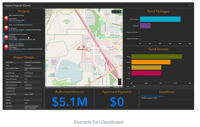
Increased transparency for the public and other stakeholders
If you work in a public works office, someone is always calling for information. Sometimes it’s the mayor calling for an update on a project. Sometimes it’s a citizen asking how much longer their commute is going to be delayed by a lane widening project on their way to work. And sometimes, in the worst case scenarios, it’s an auditor who wants to review a vast swath of project information. In the past, responding to these information requests could be time-consuming and headache-inducing, but with construction data visualization, you can respond quickly – or even provide stakeholders with the tools to check information themselves.
For example, through our integration with Esri, we built a Construction Data Visualization extension using ArcGIS. This extension provides two pre-built dashboards that collect and display construction project data in a way that’s easy to quickly digest. In one window, you can see projects, project details, fund sources, project progress, deadlines, item quantities, payment percentages, and more. These dashboards can be shared with anyone from the project owner to the tax-paying public to provide transparent project updates, so you don’t have to spend your time digging through project files to provide answers. The map functionality allows you to see progress associated with geo-located items and assets.
Data analysis from combined sources
There aren’t many “one-size-fits-all” applications for construction project management out there, and even if there are, there isn’t always funding available for such robust applications. Many infrastructure construction teams are using digital tools they’ve cobbled together – a platform like Appia for recording daily reports and other project details, a separate application for e-ticketing information, a third for civil rights and labor data, not to mention hardware tools that could range anywhere from advanced rovers to measuring wheels. If you incorporate design into the fold, you may also be dealing with plansets and estimates that are at odds with as-built data. Construction data visualization allows teams to combine these data sources (okay, maybe not the measuring wheels) into one location for a vastly simplified analysis process.
By visualizing data from combined sources, analysts can quickly identify patterns and trends that may not be apparent from looking at raw data alone. Visualization tools enable users to spot correlations, anomalies, and outliers, which can provide valuable insights into project performance, resource utilization, and potential risks. By identifying high-risk areas through data visualization, project teams can proactively implement risk mitigation strategies to minimize the impact on project outcomes.
Are you looking for better construction data visualization tools?
We’re providing construction teams with better construction data visualization tools through our partnership with Esri. By connecting construction project data in our Appia platform to live, GIS-powered dashboards and software like ArcGIS Field Maps, teams are empowered to improve transparency, stakeholder collaboration, and reporting. It can typically be very difficult for GIS departments to gain access to construction data. By breaking down these data silos and pushing construction data into ArcGIS, you can incorporate it seamlessly into datasets for stormwater, utilities, demographics, and more. Visualizing and analyzing all of this combined data helps agencies manage everything from planning to full operations and maintenance and all points in between.
Build a better foundation for mapping and analysis when you geo-enable your construction project data. Learn more about our construction data visualization integrations here.